my-cumbria-logo, my-cumbria-logo Toggle navigation

Using an iPad, Android tablet, smartphone or other small screen for your studies will always present a slightly different view of the systems and resources you are trying to access.

The information on this page shows you how to navigate some common university systems when using a smaller screen.

When using a mobile device or tablet, many websites, systems and services will try to push as much important information onto the screen as possible. This will often mean that any sidebar menus and main navigation menus are either pushed off the side of the screen or shrunk behind either a “waffle menu” icon or a “three dots” icon •••. We will show you how this affects our systems and services, but you should be aware of this when visiting other sites.

  • My.Cumbria

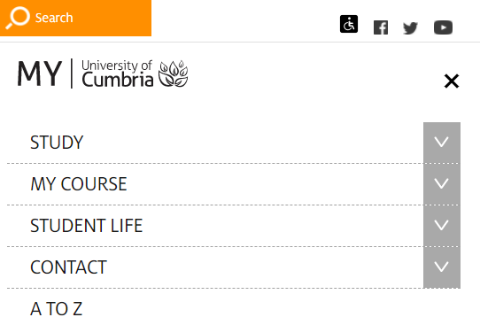
    The main top menu on My.Cumbria will collapse into a waffle menu on a small screen:

    small_screen_myc_01,  

    Note that the link to the Student Hub is available in the STUDY section:

    small_screen_myc_02,

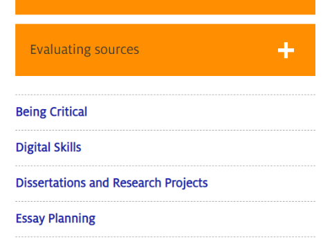
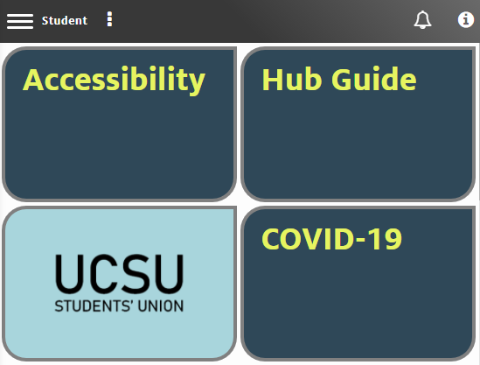
    Any pages that have a sidebar submenu will see those links drop to the bottom of the page:

    small_screen_myc_03,  

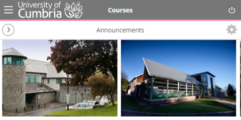
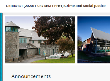
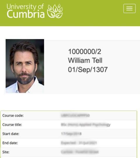
    Some images on My.Cumbria may fall off the right-hand side of the screen. These images are still fully available, but you may need to scroll or turn your device to landscape mode to view them:

    small_screen_myc_05,  

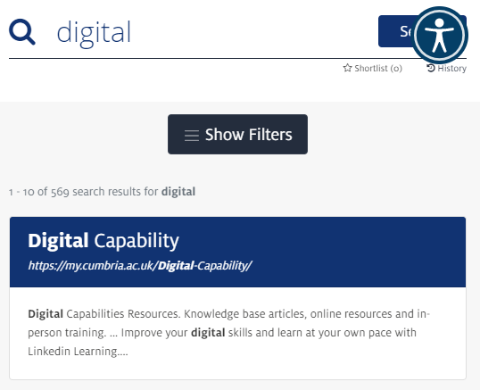
    The site search will continue to work as normal although the Search button is partially obscured on some devices:

    small_screen_myc_04,  

  • Student Hub

    The Student Hub will continue to work as normal on a small screen, with the main pages simply shuffling the content into a double column instead of the six columns that you would normally see on a larger screen. The sidebar menu is available from the waffle icon (top left):

    small_screen_hub_01,

    For your Android or Apple phone you may want to get a copy of the Student Hub App - details available on our Mobile Apps page.

  • Blackboard

    The main difference when using Blackboard on a smaller screen is that the main side menu will collapse off the side of the screen. Depending on the size of the screen, this will look slightly different.

    Please note that some images and tables may continue off the right-hand side of the screen, but you can scroll or change your screen orientation to landscape to see them.

    Blackboard on a smartphone

    On a small (smartphone) screen, the main Blackboard menu collapses behind a waffle button and the course menu will pop out from the arrow/circle icon that sits beneath the waffle:

    small_screen_bb_01,

    Blackboard on a tablet

    On a medium (tablet) screen Blackboard retains the main menu across the top of the screen, but the course menu is hidden in a collapsing blue bar on the left-hand side of the screen. Tapping on the blue bar will pop out the course menu. This blue bar is not always very visible on iPads, but it is there and you just need to tap the left-hand edge of the screen:

    small_screen_bb_02,  

  • Student Email

    Your student email account has been configured to work well on mobile devices and smaller screens. From the main screen you can read your emails and easily create a 'New message'. All of your folders are hidden behind the waffle menu which pops out when clicked. Your Outlook calendar is available by clicking the calendar button at the bottom of your screen.

    small_screen_email_01,

    Additional functions are hidden behind the 3-dots menu including Chat, Notifications and Settings:

    small_screen_od_04,

    And additional Office365 apps are hidden behind the 9-dots menu including OneDrive, Word online, PowerPoint online and more...

    small_screen_od_05,

    You may also consider getting the Outlook email app for your mobile device. See our Mobile Apps page for more information.

  • OneDrive

    As with your student email, your university cloud storage (OneDrive) works very well with smaller screens. You can easily see all of your files and folders:

    small_screen_od_01,

    On a small screen you can still create new objects such as a folder or Word document:

    small_screen_od_02,

    You can also upload files from your device, to create a copy in the cloud that you can access from any other device or computer:

    small_screen_od_03,

    Behind the waffle menu you will find some additional functions such as a list of recent files and the recycle bin.

    OneDrive also includes the 3-dots and 9-dots menus found in Outlook email (see above).

  • ICON - My Student Details

    The ICON system works fine on smaller screen and allows you to view your modules, confirmed grades and your University of Cumbria profile. You can also edit some details including phone numbers, home address and personal email address. Some additional functions may also be available through the waffle menu, including the ability to logout of ICON.

    small_screen_icon_01,

  • Timetables

    The timetabling system does not play well with smaller screens and although it works, we recommend that you try to view timetables on a laptop or PC as all of the content continues off the right-hand side of the screen. This happens in both the timetable browser and the actual timetables:

    small_screen_tt_01,

  • Linkedin Learning

    Linkedin Learning collapses a lot of content within the main menu bar and also presents the individual course menus behind a waffle icon. The content visible on a small screen includes:

    small_screen_lil_01, 
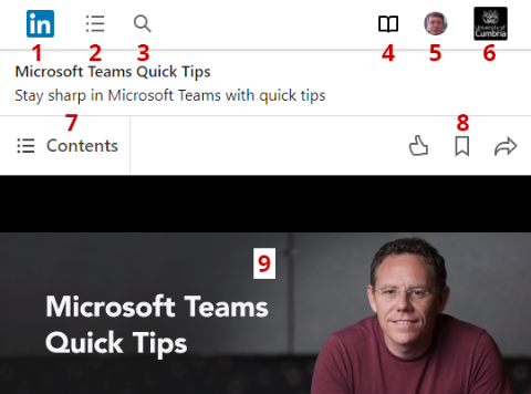
1. Linkedin Learning Home

    2. Browse all courses by subject

    3. Course search

    4. Your progress area

    5. Your profile and settings

    6. Content recommended by University of Cumbria

    7. Contents menu for the current course

    8. Liking, bookmarking and sharing buttons

    9. The current video within a course (this video will resize to fit your screen)


    We can also recommend that you get the Linkedin Learning app for your mobile device. See our Mobile Apps page for more information.

Edit page